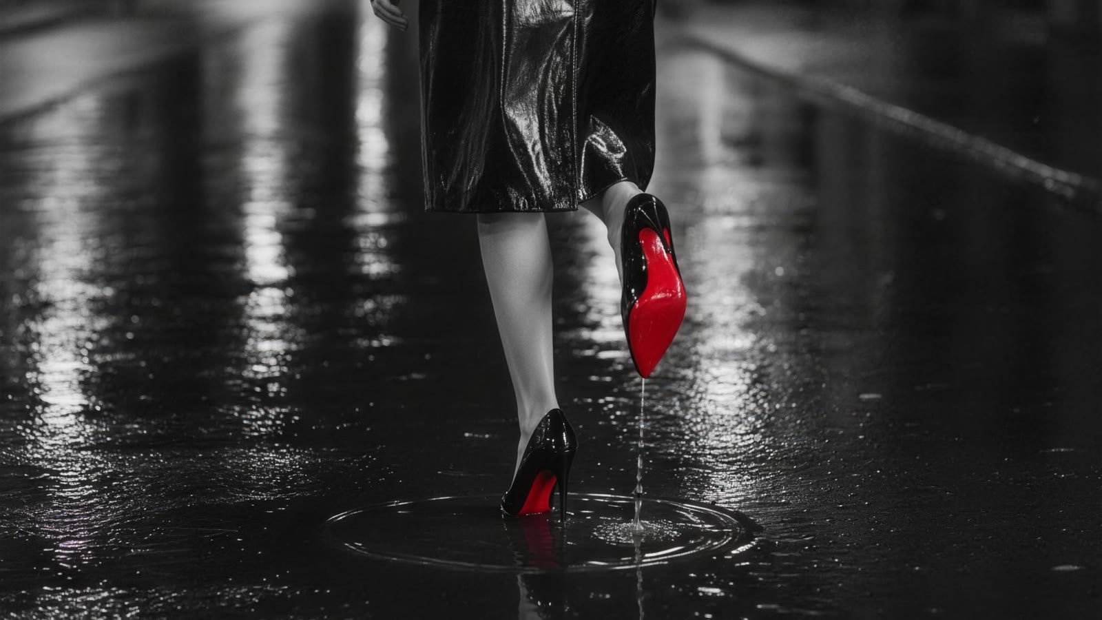
Hang fifty paintings in one room and watch where a stranger's eye goes first. It will not go to the largest canvas, or the most famous name, or the one with the most figures in it. It will go to the red. This is not taste; it is closer to reflex. Against a field of browns, greys and blacks, a saturated red is the single highest-contrast signal the human eye can be given, and the brain treats it as information that cannot wait. Painters worked this out long before anyone could explain it, and the best of them learned the harder lesson that follows: the effect only survives if you use it once.
The most expensive decision on the palette
For most of art history, using red was not merely a compositional choice — it was an accounting one. The brilliant orange-red of Pompeian walls and Renaissance robes was vermilion, ground from cinnabar or synthesised from mercury and sulphur (HgS), and it was ruinous. The deep crimsons that glow through Titian's draperies were lake pigments, dye precipitated onto a transparent chalky base: madder, whose colouring principle is alizarin (C14H8O4), or kermes, harvested insect by insect from Mediterranean oaks.
When Spanish ships began bringing cochineal back from Mexico in the sixteenth century, Europe met a red roughly ten times stronger than anything it had — and it became one of the most valuable cargoes leaving the Americas, second in worth only to silver. Red was, in the literal sense, wealth applied to a surface. That is why a red cloak in an old master painting is almost never decorative. It marks the person who matters, and it announces, quietly, that the patron could afford to say so.
Black does not compete with red. It clears the room for it.
What darkness gave red
Red's real leap forward came when painting learned to switch off the lights. In the seventeenth century, Caravaggio and the generation who followed him abandoned the even, sunlit interiors of the Renaissance for backgrounds of near-total blackness pierced by one hard beam — the technique we call chiaroscuro, and in its most extreme form, tenebrism. Something unexpected happened to colour inside that darkness. Reduce a picture to black, brown and flesh, and a single red drapery stops being a garment and becomes an event.
Look at Caravaggio's Death of the Virgin in the Louvre: an enormous red curtain hangs across the top of the canvas and the dead woman wears a red dress, and between them they carry the entire emotional weight of a painting otherwise built from shadow and unwashed feet. Nothing else in the picture is allowed to be that colour. The restraint is the technique. A second red would have halved the first one.
This is the same economy that governs the use of gold leaf in medieval and Byzantine panels — a material so loud that it has to be rationed to survive, as we traced in gold in art. Rare, expensive, attention-grabbing materials all end up teaching artists the same discipline: spend once, spend well.
Red without an object
The twentieth century did something stranger. It cut red loose from the things it used to describe. Matisse's The Red Studio (1911) floods an entire room — walls, floor, furniture — with a flat Venetian red, leaving the outlines of the vanished objects as thin bare lines; technical study of the canvas has shown he painted that red over a cooler, more conventional interior. The subject is no longer a robe or a curtain. The subject is the red.
Rothko pushed it further into the dark. His Seagram murals, now at Tate Modern, are built from maroons, plums and blackened crimsons layered in thin washes so that the colour appears to hover somewhere in front of the canvas rather than sit on it. He wanted them shown in low light, close together, in a small room. He was, in his way, doing exactly what Caravaggio did — putting red into darkness so that it would breathe — with the figures taken out.
Cinema then borrowed the whole idea and made it obvious. A monochrome image with one object left in colour is now a recognised grammar: the girl's red coat in Schindler's List, the selective colour of Sin City. It works for the same reason it worked in 1606. When one thing is permitted to be red, the viewer does not choose what to look at. The picture chooses for them.
A contemporary case: one colour, one rule
The idea is old enough that most contemporary artists use it in passing. It is rarer to find someone who builds an entire body of work on it. The fine-art photography gallery Redonnoir — the name is simply red on noir — works to a single self-imposed constraint: every image is black and white apart from one scarlet accent, usually the lacquered red sole of a shoe. Rain-black streets, marble, patent leather, cinematic side light, and then the one permitted colour.
What makes it worth looking at as an art-historical argument rather than a styling trick is how visibly the constraint does the compositional work. In L'Ascension, a figure in black lacquer climbs a marble staircase and the only colour in the frame is beneath her raised heel — so the eye is pulled upward along the stair whether it intends to go or not. The red is not the subject; it is the instruction. In Écarlate the same gallery drops the figure entirely and lets red silk pour across black lacquer as a pure abstract still life, which is roughly the Matisse move: colour released from the object it used to belong to.
Whether one calls it photography, fashion image or contemporary still life matters less than the lineage. A single high-value colour, held against darkness, deployed exactly once per frame — that is a rule with four hundred years of evidence behind it.
What to look for
Next time a red stops you in a gallery, ask two questions before anything else. First: how much of the surface is actually red? The answer is usually far less than it feels — often under five per cent, sometimes under one. Second: what is the darkest value nearest to it? Almost always, the deepest black in the painting has been placed within an inch of the brightest red, because the two need each other; the black gives the red its heat, and the red gives the black its depth.
That reciprocity is the whole trick, and it is the sort of thing that becomes visible the moment you know to look for it — the same habit of slow, structured attention that turns a pretty picture into a legible one when you set out to read a masterpiece.